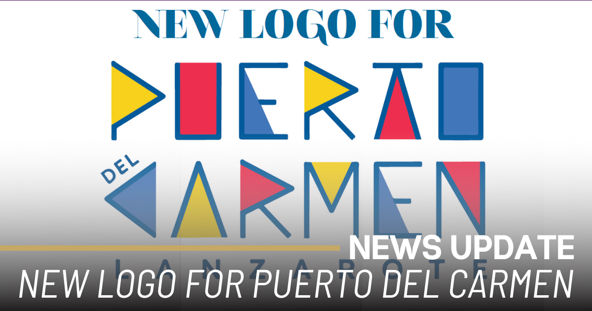
Puerto del Carmen launched its brand new logo (above) in late April, as Lanzarote’s most important tourist resort announced details of it’s Third Modernisation plan.
First published June 1st in the Gazette Life magazine.
The new logo was explained by Tenerife-based designer Rebeca White, who based the design on one simple shape – the triangle.
Triangular shapes are common in the early Berber alphabet and other ancient geometric patterns that have been discovered carved or painted in ancient sites on the Canaries. The shape was also frequently used by César Manrique in his abstract designs and paintings. His wind toy titled Róbalo, which was recently reinstalled at the roundabout at Los Pocillos, features a shoal of multicoloured fish, all represented with simple triangular patterns.
White also explained that triangle representedthe distinctive shape of the sails that propelled Puerto del Carmen’s historic fishing trade.
The angular logo is a radical departure from previous designs, but what hasn’t changed is the four-colour scheme used by the resort: bright blue to represent nature; red to reflect sport; yellow to represent the arts and a darker blue to reflect culture and history.
The logo is accompanied by a graphic – an equally geometric love heart consisting of eight diamonds in the same four colours. Within each diamond is a pictogram representing fish, a sun umbrella, a Manrique mobile, the sun, musical notes, a palm tree, a sailing boat and a bicycle.
These designs will form the basis of Puerto del Carmen’s publicity campaigns in the years to come, and they already head the homepage of www.puertodelcarmen.com, the resort’s main online tourist portal.
For regular updates, pictures and videos of Lanzarote be sure to like and follow our Facebook page “Gazette Life Lanzarote”.

